The Lennings
The Lennings is a Berlin-based local running club.

Overview
The Lennings is a brand identity design project that unites a community of running enthusiasts in Berlin. The core metaphor of the project is family — a team bound by shared energy and individuality, whose goal is to run their own path, standing out from the crowd of other Berlin running crews.
The concept was translated into sports apparel, giving the brand its own distinct voice. The runner became the key visual, forming a unique emblem based on expressive lettering.

Concept
This stage of work is the most challenging and the most fascinating part of design development. It requires translating meaning and abstract ideas into a verbal expression — a metaphor — and then turning it into a tangible visual form, a material object with defined shapes and structure.

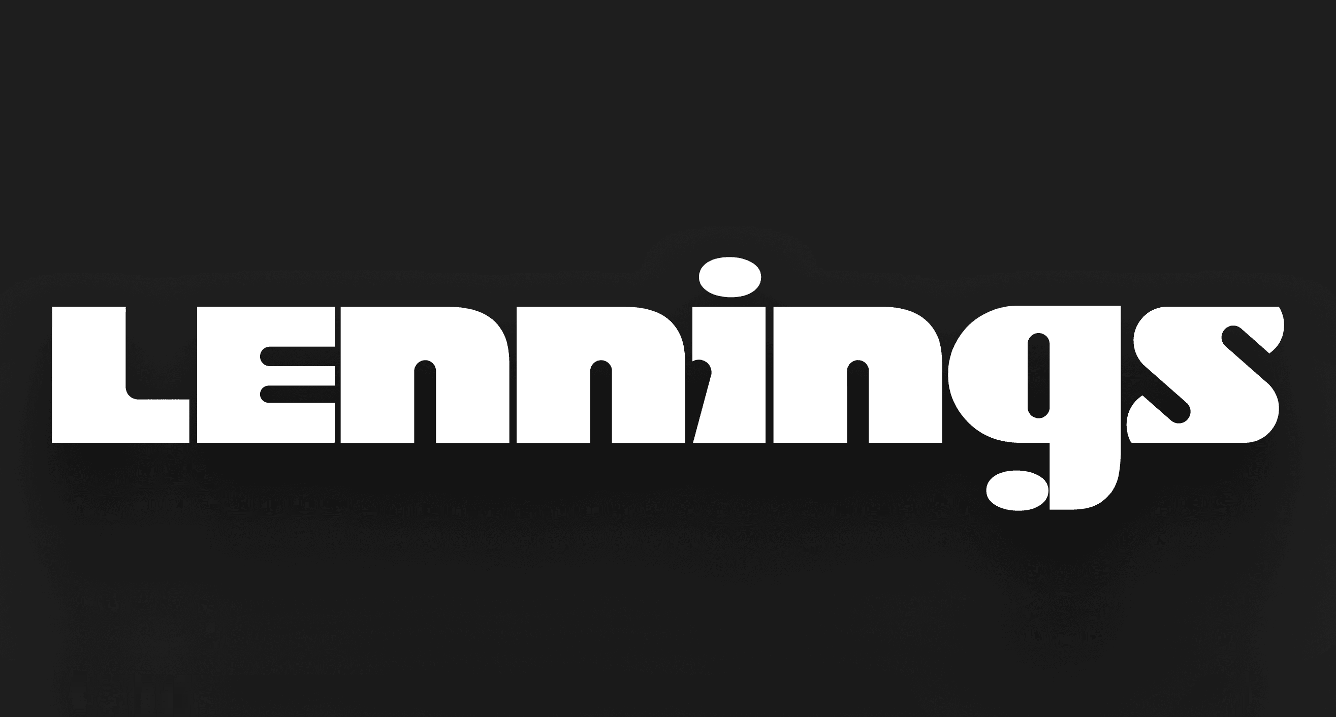
This led to the creation of a custom lettering logo “Lennings” (without “The”) to enhance readability — designed in both vertical and horizontal versions.

Interestingly, the vertical version came first, as its three-level composition visually resembled a winner’s podium at a race. That moment marked the birth of the first visual image of the identity.


Moodboard
A moodboard was created to help define the precise creative direction. Beyond being a tool for exploring design solutions and developing compositional thinking, moodboards also serve as an excellent brief for understanding the client’s preferences — there’s often so much insight revealed through discussing references.

Visual Concept
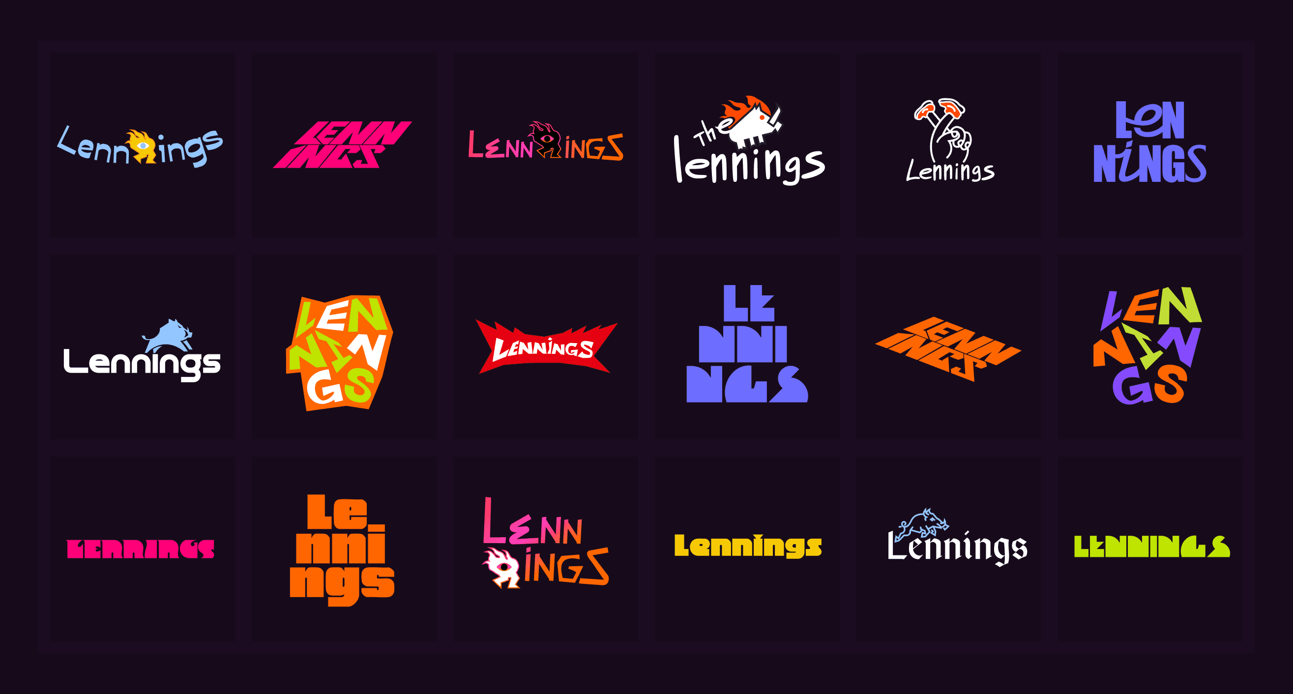
Once we identified the overall visual style, I proposed six conceptual directions. The client chose the first two directions — the complex multi-level typographic composition and the single-line typographic composition.

Sketches
During the logo development phase, I created and presented over ten graphic concepts to the team. Eventually, by the third iteration, we agreed on one direction. After that, I began experimenting with typefaces and letterforms, searching for the right silhouette and visual rhythm.
At this stage, I realized that the most expressive solution would be a geometric grotesque typeface with dense, even strokes and wide proportions, conveying a sense of confidence, balance, and stability.
Logo
From the very first meetings, the design task for the logo was clearly defined: it had to be a well-readable logo in two versions — vertical and horizontal, adaptable to different sizes, and prepared for print application on various types of sportswear, where it would appear alongside the brand label and the athlete’s bib number.



Visual Communication
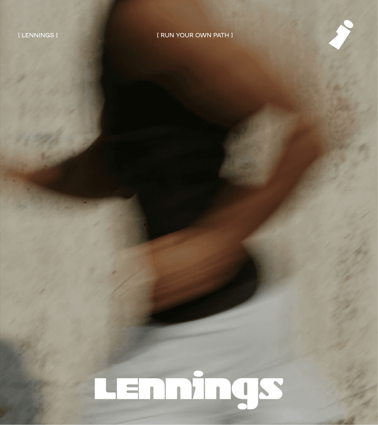
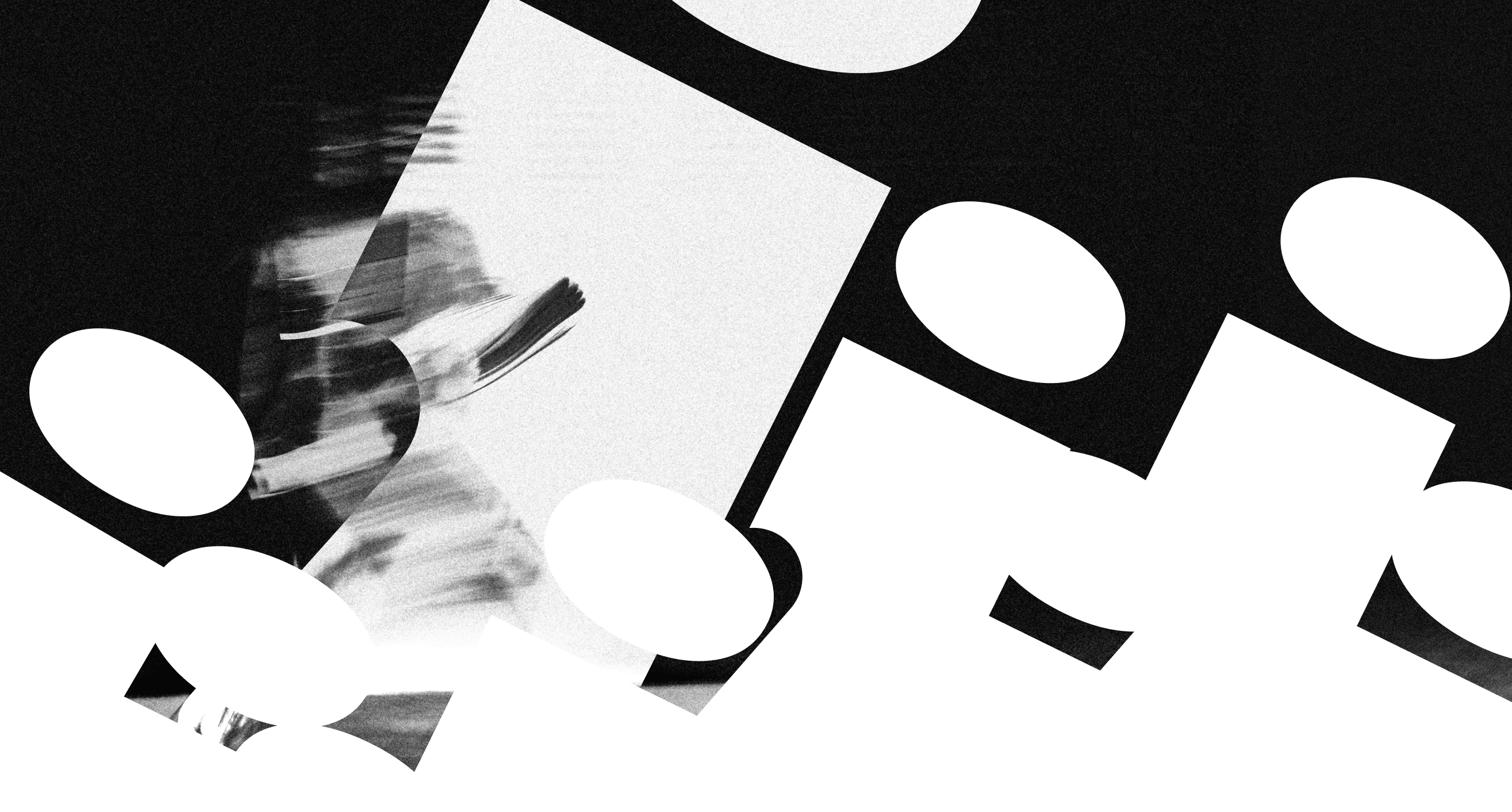
While working on the vertical version of the logo, I noticed that the letter “I” naturally formed a charismatic runner silhouette. This discovery became a key visual element that I developed into graphic compositions — used across social media, posters, and printed materials.
This shape later inspired a series of playful collectible pins, each carrying its own micro-metaphor or humorous expression. The brand pattern emerged from two mirrored “S” letters facing each other. When their silhouettes are joined, they form an arrow — a symbol of movement, speed, and direction.



Printed Matter
This stage was the most technically challenging. It required designing a versatile print template for apparel that could adapt to various garment formats and use both logo versions at different scales.


Thanks to the Lennings:
Ilya Suntsov, Lennart and The Lennings crew!
The end is
always a beginning
All the works
