
Sleeping Kids


Overview
In 2023, I joined the project with the clear goal of creating a visual identity that captured the warmth, trust and emotional intelligence behind my client’s approach — a brand that felt both modern and deeply human.
The end result was a comprehensive brand system comprising a visual identity, packaging and digital communication, all centred on the promise of 'happy, contented and balanced children'.
Idea
The brand expresses sleep through two universal symbols: the lightness of a feather and the calming rhythm of a heartbeat.


Logo
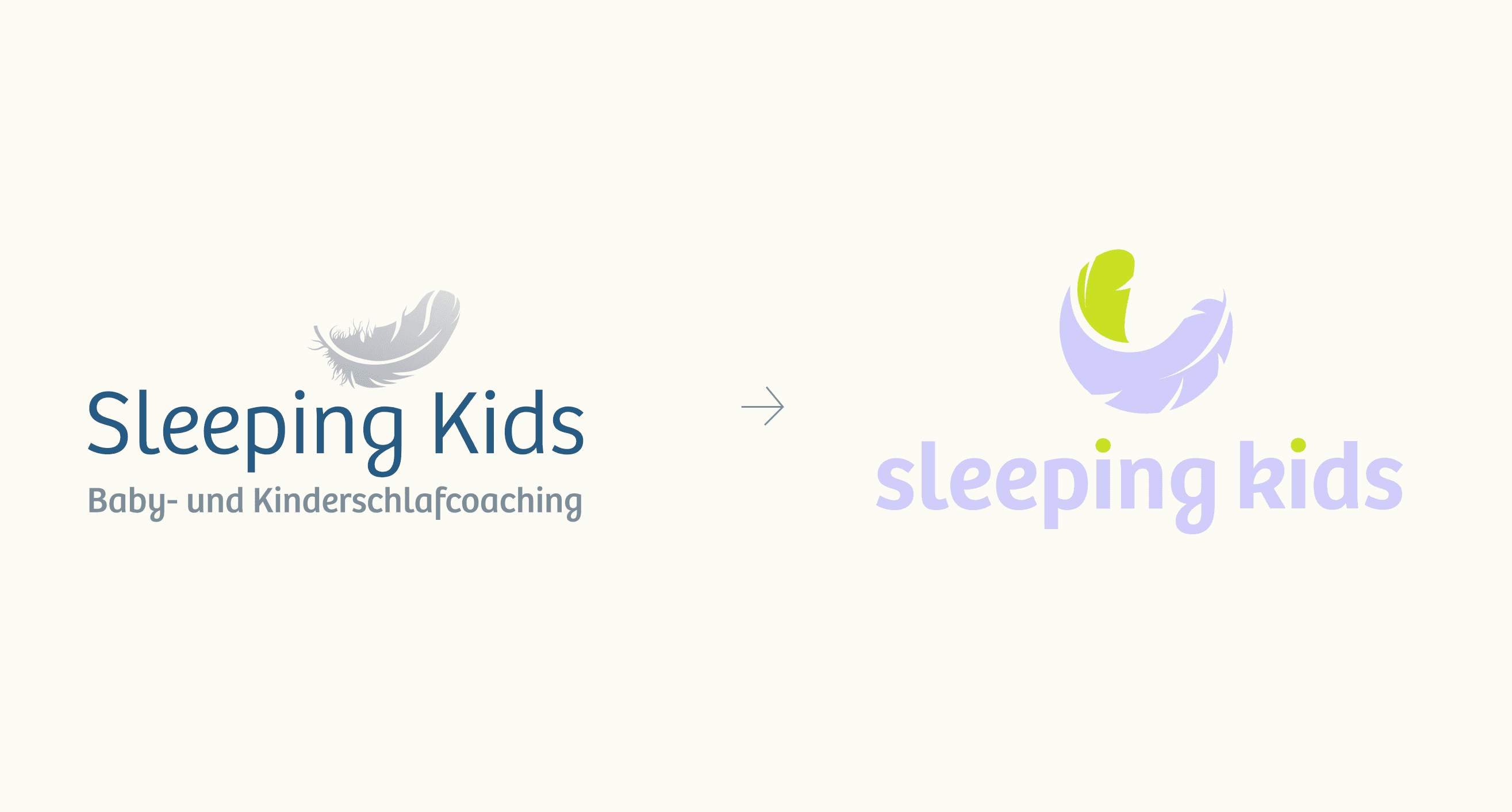
The logo was redesigned while preserving the feather as the brand's core metaphor. Refined geometry, optical balance, color system, and custom typography transformed it into a cleaner, more distinctive identity system.


Visual Language
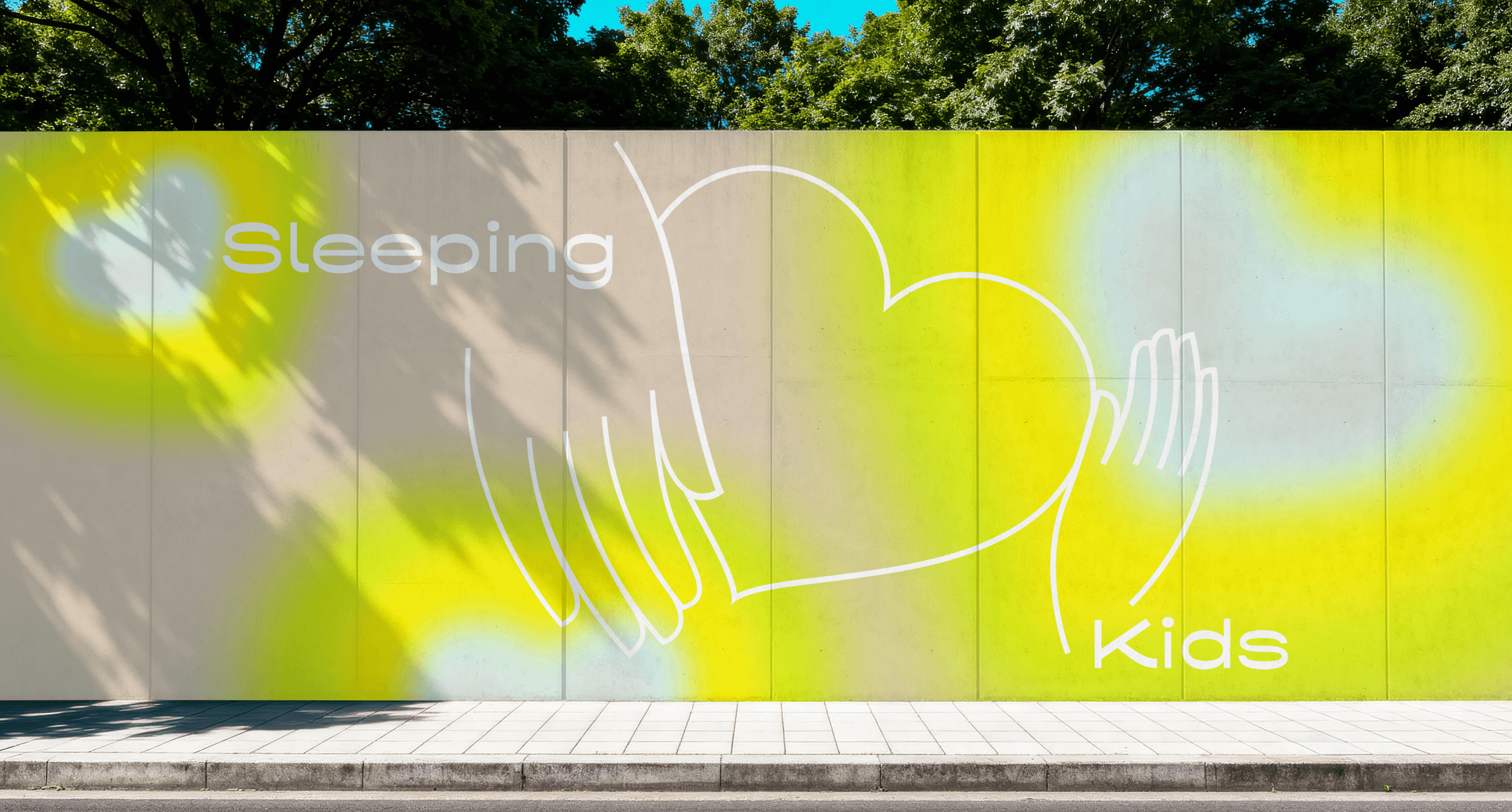
A heartbeat became the second core metaphor, evolving into a graphic language that expresses calm, comfort, and peaceful sleep across every brand touchpoint.


Brand Applications
The heartbeat evolved into a distinctive graphic language, extending the identity across packaging, digital media, print, and brand touchpoints.


The end is
always a beginning
All the works
