
Wit

Overview
WIT approached us to create a distinctive brand identity for a fintech platform combining traditional banking with digital assets. I developed the core creative concept, visual metaphor, and identity system, which later became the foundation for the mobile app experience.
Idea
The identity is built around the idea that managing money should feel simple and approachable. Bright colors, playful geometry, and a friendly mascot balance the seriousness of finance with a sense of confidence and ease.

Logo & Visual methaphor
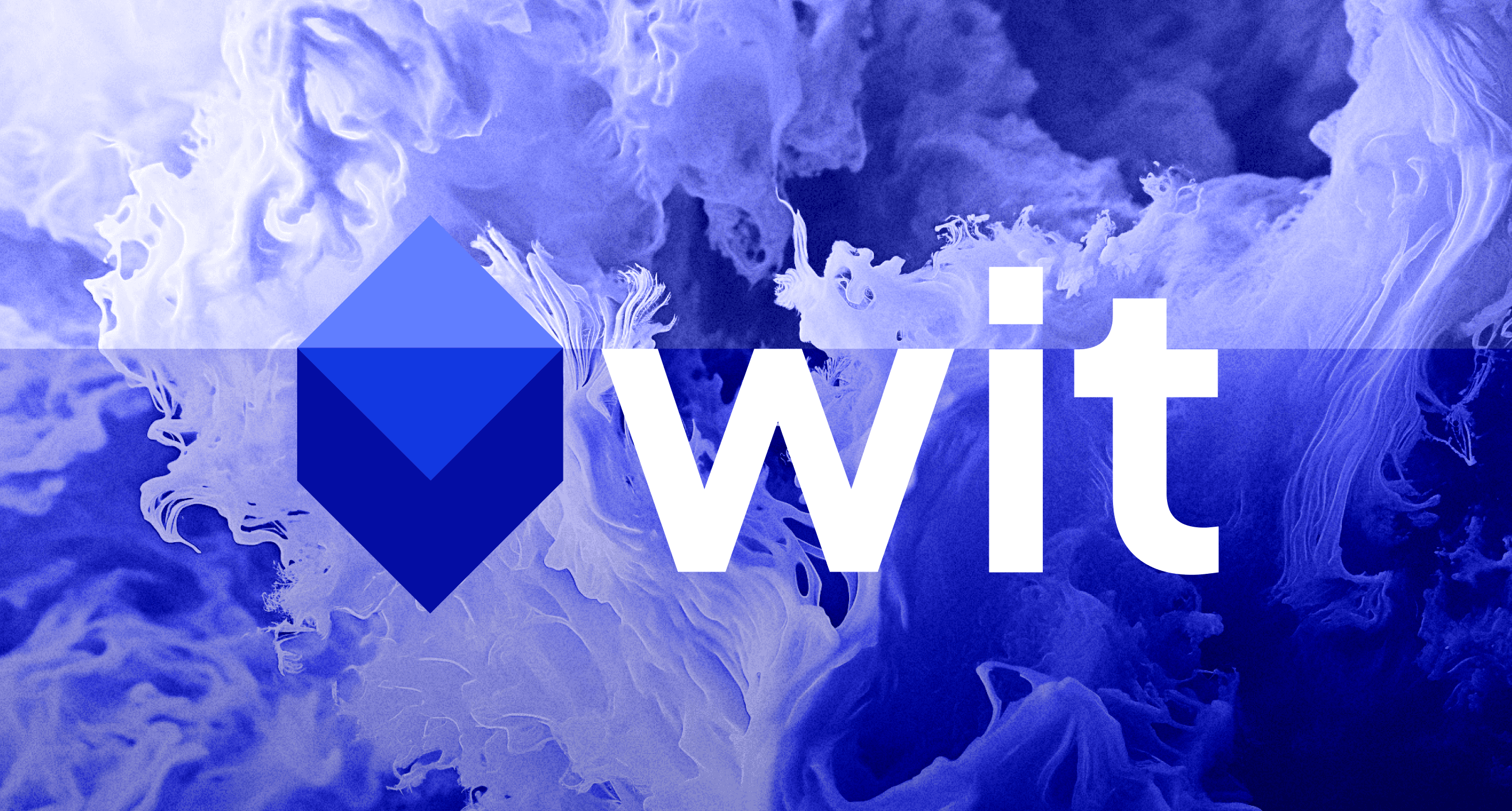
The identity began with a broad exploration of visual metaphors. After mapping multiple associative directions, the iceberg emerged as the strongest concept—capturing the product's dual nature. From there, the symbol was refined through sketches, moodboards, and a geometric construction system to create a distinctive and scalable mark.





Mascot
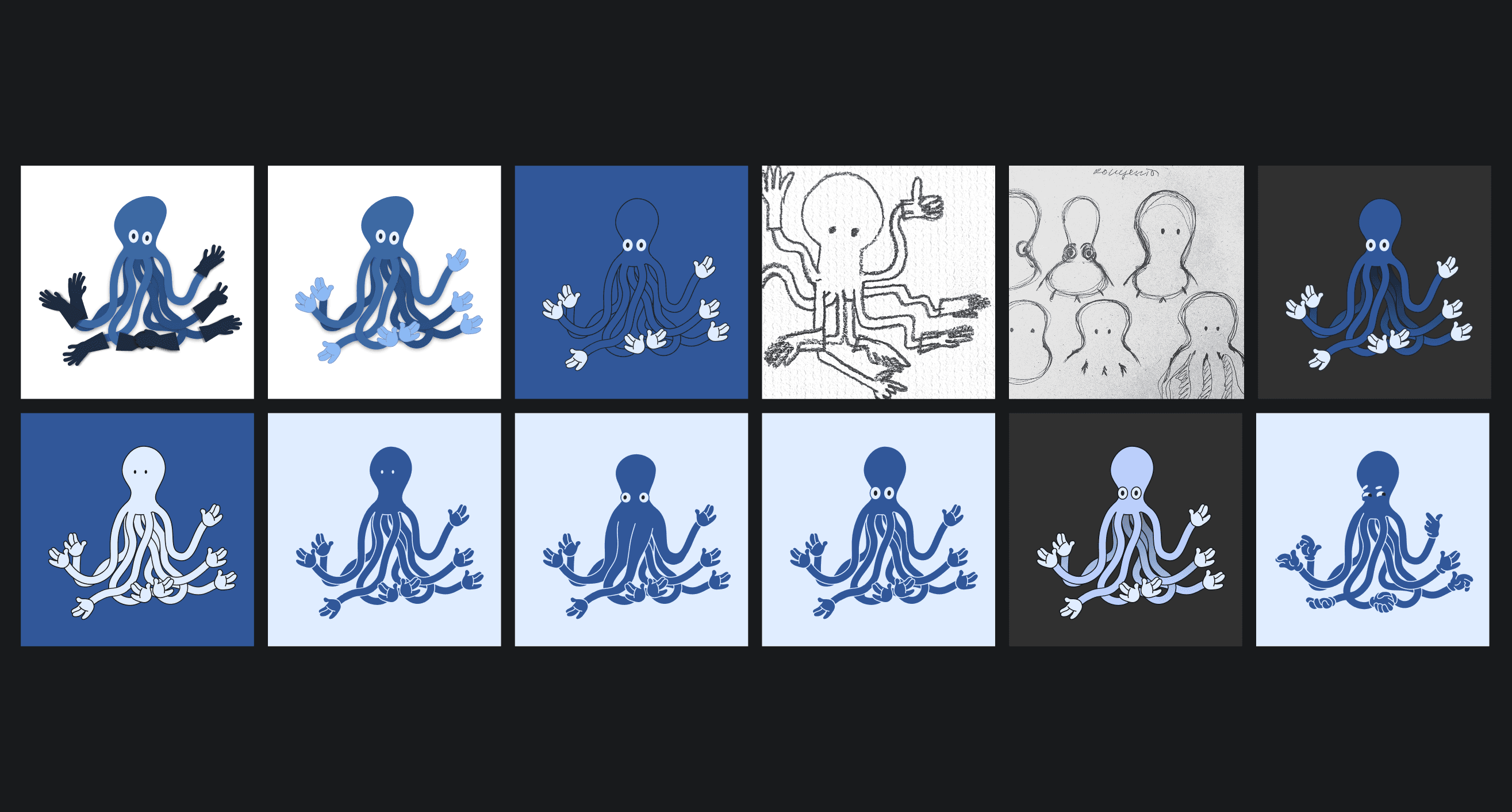
To balance the precision of the identity, we introduced a playful octopus mascot. It brings warmth, personality, and emotional guidance to the product, making complex financial interactions feel more approachable and engaging.



Bringing the Brand to Life
The identity expanded into a complete brand system across print, merchandise, outdoor media, and digital touchpoints. Its success laid the foundation for the next stage of the project—the design of the mobile banking application.


The end is
always a beginning
All the works
