
Product Camp


Overview
ProductCamp invited our team to redesign its visual identity and website. I developed the core creative concept, visual metaphor, and design direction, transforming a series of disconnected event pages into a cohesive digital experience for the community.
Idea
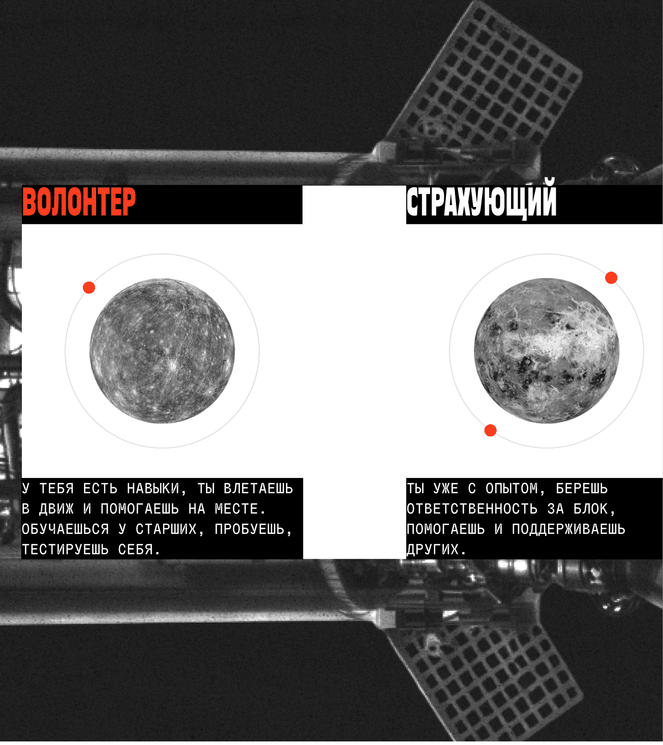
The identity is built around the metaphor of shared orbits—where knowledge, experience, and people continuously move, intersect, and grow together as one community.

Creative Direction
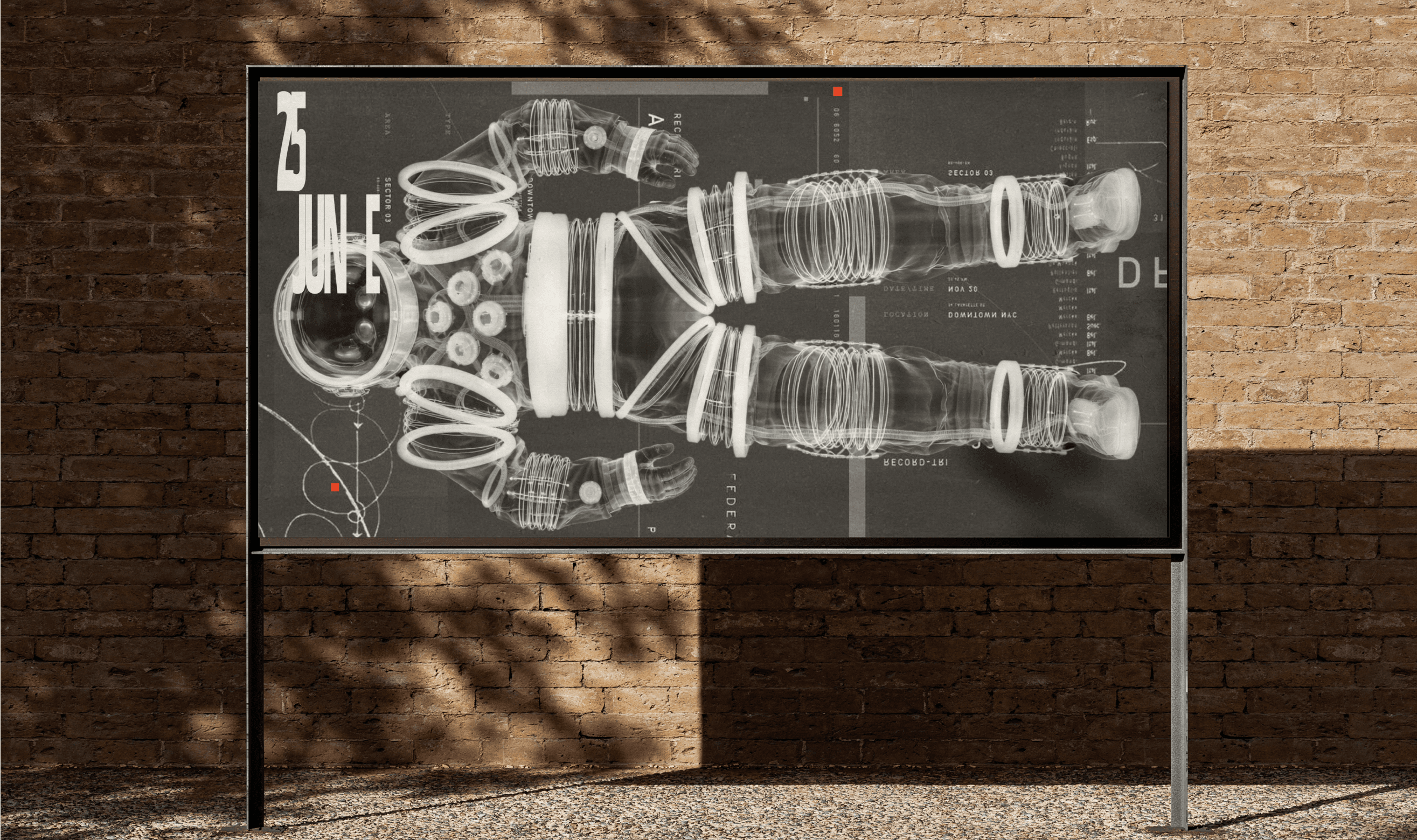
With the core metaphor defined, the next step was to build a visual language capable of expressing it. Through posters, experimental layouts, typography, orbital graphics, and retro-futurist references, we explored how the identity could communicate ProductCamp's energy, curiosity, and collaborative spirit across every medium.
Website
The visual language comes to life through the website, transforming the orbital concept into an immersive digital experience. Modular layouts, expressive typography, and dynamic compositions create a platform that feels as open, collaborative, and energetic as the ProductCamp community itself.


Astronaut
The astronaut was reimagined as the face of ProductCamp, evolving from a familiar event symbol into a distinctive brand character. It brings personality, curiosity, and a sense of exploration to every interaction with the brand.


Visual Communication
The identity extends seamlessly across event graphics, social media, merchandise, and digital assets, creating a consistent visual language that keeps every touchpoint unmistakably ProductCamp.


The end is
always a beginning
All the works
